Belle Isle Fantasia

Post 1d

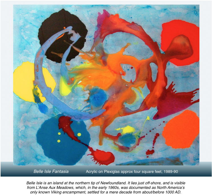
When the pools of colour had finally dried I turned over this piece of plexi to see if I had captured anything worthwhile in the randomly, almost blindly applied colour swaths.

The central swirl of raw, savage, ruthless colour, and shapes, and visual texture were immediately captivating and seemed laden with a very intense meaning … and, in a curious manner, demanded an archeological process of excavation, of examination of layers of thought and association, through which I would discover what this attempted piece of art really meant.  It’s akin to becoming a writer in order to figure out what you think.

The most immediate suggestion was of something apocalyptic.  Also, there was something true in feeling to my own local, very northern landscape and sky, which could at times be as fierce and as unsympathetic as the imagination says Tierra Del Fuego is in its even more distant southern exposures. This explosive sensational fantasia soon morphed into a glimmer, a patina, a shimmer of local history, of how shattering the culture inflicted on the area’s indigenous folk a millenia ago when Vikings descend upon them in northern Newfoundland: alien wayfarers; alien technology; alien behaviours; new, and very unfriendly notions of rivalry and of ownership of local resources; searchers for loot and booty to trade in Europe—in short, nothing short of a localized apocalypse.

But the image, at that point, didn’t yet have its Jupiter-like ring and wheeler/dealer orbiter moons: in this case the elliptical outer orbit of yellow-blue-orange-red-black.  Nor yet, in its lower right edge, the suggestion of any island.  The message was clear from the painting itself: it already knew most of what it wanted to trade in for its endgame definition.  My task would be to discover and resolve how to fulfill the needs of the core image, as it was not yet visually complete.

With coloured, torn-edged paper circles I explored for the exact placement of where these controllers ought to be, how to size, re-compose and stabilize the orbiters, and of which colour to specifically place where.  A slow and careful exploration eventually revealed a near pitch-perfect solution.  The outlines of the ragged forms were pencilled, and then slowly, carefully, very carefully, excavated from the back surface until clear of colour except where the original image needed to remain intact.  Then the five new shapes could be and were painted in.  The painting, however, remained incomplete until I recognized that a well-placed island would increase contrasting depths, imply greater reality, and lock everything into place.

Then it was that this painting confirmed my own definition of triumphant abstract: specific reality-bound content, specific intensity of feeling, spatial depth, dazzling colour: all achieved in the contemporary context of materials; and all in free, yet also highly controlled,  collaboration with accident: one might say—a contemporary understanding of how to meet life on the problem solving terms it offers, in fact demands of us.

Poured Paints

Cabot-Lodge2

Pouring paints upon a surface, by the late 1980s when this image was created, was no longer accepted as a creative act.  It was considered copy-catting.  Old Hat.  Outmoded by nearly a half century. And yet . . . this image is absolutely different and original from any ever poured on canvas.

Moreover, the image presented here delightfully defies four other dogmas settled upon the act of painting by painters and their art critics of the 1950s and 60s.  Strident proclamations and manifestos, verbal and written, were made that a painted image should eliminate all spatial references in order to be fanatically in tune with its 2-D surface; a second equally rubbish commandment was that forms should not evoke reality; thirdly, that the content of art could concern itself only with its own abstract formal elements—colour, texture, shape, composition—and lastly, that all narrative aspects of image must be avoided at all costs.

Artists quickly painted themselves into monastic (or ivy league) corners with their stripes, chevrons, targets, and numinous mists.  A few suicided out of the muddle, or complicated it even more with heavy alcohol consumption allied to a penchant for reckless driving.  A few, like yours truly, shrugged off the demands of this newly ascended / assembled / self-appointed painting academy-in-the-sky: We would set our own rules.

Having gone off the artistic grid myself by choosing, in 1972, to live a creative life in a very small town in northern Newfoundland, I felt no obligation to blindly follow all the modern canons set out in my university’s Art History Major brain washings, 1967-1972.

Attempting to pour liquid colours upon resistant, slick plexi instead of onto absorbant canvas injects a totally different interaction between the colours, and how they will settle out as they dry.  Add in the complication of working in reverse and there is a huge learning curve of acceptance of accident; of guiding rather than controlling the process; of becoming extraordinarily alert to the possibilities of the ground and the paints; even of which colours are not chemically compatible (and, if that were the case, how might that be creatively exploited to best advantage).  It would sometimes take two or three days before the pools of paint dried enough to turn over the plexi to find the exact nature of what had presented itself on my own miniature self-defined altar.

In this instance I had no doubt that a completely original, lovely, lyrical piece of art had come into existence out of my humility before, and my collaboration with, the most contemporary of materials.

Mid-Stream Plunge

Post1c

Here is an acrylic painting on plexiglas with the working side being the back surface.  Which of course means that the artist is always working in reverse, and had better have a mirror close at hand for a constant check on the best possible balance and placement of all visual components.

The front surface has no layer of paint.  One aspect that attracted me to working in this peculiar way, and with this particular medium, is that colours are not diminished in intensity as they dry, instead they retain that wet-paint-in-the-can look, and the glossy viewing surface adds its own lush brilliance; a disadvantage of the medium is that plexi is physically heavy—compared with stretched canvas—and working a surface area of more than six square feet, while trying simultaneously to protect the viewing side from the least abrasion, becomes increasingly awkward.  However, the gem-like dazzle gained is worth the smaller size, and in this instance the image manages to suggest one of huge scale anyway.

About My Posts

Post1b

Drawing, painting, sculpture, photography, poetry, and music are all integral to my work as artist.  We could also include layout and design as I often want to have complete control of the look of any page upon which a poem of mine is set; or when I approach the making of a video and hope to imprint it with an all encompassing unity of vision.

(YouTube video link)      https://youtu.be/Ubx-EpPHh0Q

All of these interests intersect, overlap, and interweave as I explore my interests with as much variety as possible.  I value them all.  And the posts I offer will reflect those artistic interests, as they in turn express my understanding of the complex world in which we live—for me personally, one art form alone cannot speak to all the responses that engage me.