Arthur ‘Artur’ Rubinstein, Pianist

Post 4c

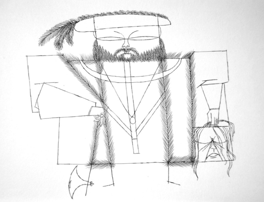
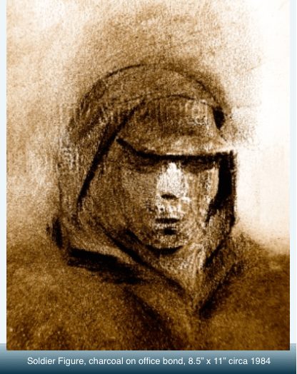
If you check through the several drawings of faces I’ve posted to date in this blog you will see that the approach is rarely ever the same.  And that is a truth that applies to each and every one of several hundreds of faces I’ve drawn over five decades.

In part this is because every personality attempted is strikingly different.  And in the other part it is intentional: my goal is always a rendering that is its own master of the page on which it appears.  To that end I’ve always been willing to sacrifice consistency of style and technique.  The only consistency I espouse is one of concept and the best possible realization of that concept.  If I need to adapt line and crosshatched tones to achieve it, then that is where I must go, and I will need to forego my own egoistic concerns with always being predictable in the presence of other artists and critics.

My entire end-game as artist is to master every possible way a technique or media can be used—there is more artistically and aesthetically for me to gain if I set up a different problem every time out—solving the same problem over and over and over can only end, at least for me, in personal futility and boredom.

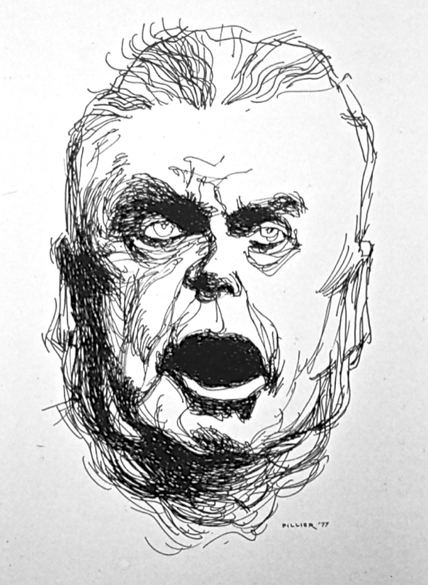
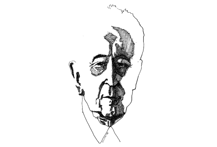
If that appears in any way to be a defence, or a rationalization of my preferences and approaches, then OK.  I don’t mind.  The singular face arrived at in the above drawing was well worth it.

Here the subject was Arthur (Artur) Rubinstein, venerated as a master musician through much of the 20th century.  In his latter years his face actually registered his incredible inner mastery of himself, of the piano keyboard, and especially of the music of his fellow compatriot Chopin.   He had elevated himself into this sort of totem and symbol of power and indomitable endurance.  He lived to be 95 and had performed publicly / internationally for eight decades.

My job was to find, amid the many public images of the man, that inner Artur and give it as profound an expression as possible at the moment of drawing.

This drawing, like most in my personal collection, has never before been publicly shown.

Sailor on Belvy Bay

Post 4b

This acrylics on plexiglas, whether in the detail (above), or the whole painting (below), is all about organic nature played off against geometric forms: the man-made.  The overall shape is that of a head with its fantasy of sailing boats, docks, a village church (the top of the yellow sail is its steeple), mooring buoys, sunset, moon/eye, water and sky, and all running at a full high tide.

In this picture I was especially interested to demonstrate and exploit the total flexibility of acrylics—its range from the loosest, thinnest, most diluted watercolour effects to glowing translucence (that profoundly deep blue in which floats an aluminum foil full moon), to the absolutely flat, dense, and to the utmost brilliance in saturated colours.  Unlike oil paints, acrylics can also be laid down easily, if required, with absolutely exquisite perfection of edge.

The hard-edged curves and shapes were deliberately intended to evoke the exuberant sound / shapes / colours of French and English Horns in full call across an evening strait or bay, with a sail or two bending in the fading light and winds of evening.  And an entirely new perception occurs to me now: the red shape also suggests a humming bird that has just sated its taste for nectar and is softly backing away from a deep-throated flower—the flower of life.

In a very separate context, somehow the inner content, the inner life, the spirit of the whole image is so complete and fulfilled that every time I look at this painting I associate it with a line from an old John Masefield poem that we were encouraged to memorize as school children “. . . and may there be no moaning at the bar when I put out to sea”.  It’s a picture without regrets.

Post 4

Sailor on Belvy Bay, NL   Acrylics on Plexiglas   32” x 38”   1989

Rhapsody in Bone

Rhapsody1

The photos presented in this blog entry are all of a single bone sculpture.  Its true scale is demonstrated below in photo #2 / right-hand column—it is scarcely more than half a hand long, or wide.  But in close-up the object views as delightfully grand, even monumental, while at the same time remaining both simple and elegant.

I’ve also celebrated this object as Rhapsody in Bone in a video on YouTube.

Its viewing link is: Rhapsody in Bone

Rhapsody2


The Chief’s Song

Post 3d

John George Diefenbaker, Canada’s 13th Prime Minister (1957-1963) as depicted in this smaller than life-sized drawing.

Made in 1977 it is in ball-point pen showing the elderly politician in the full, high-blown rhetoric that recalls his two decades plus of print media, and other coverage of him from radio and TV news sound clips.

It was drawn in my usual innovative style, meaning, that while I did have photo references at hand, I approached it without premeditation, or preparation, as to proportions and placement of features; I preferred to make whatever adjustments necessary along the way keeping the most casual, and unacademic, and unimpeded flow possible of pen to paper.

I was also keen to equally register the face I heard: After all, there was no such thing as a “still” photo of John Diefenbaker.

In a small label design office one summer job in Montreal, 1967, the Secretary / Receptionist told me, with much joy and enthusiasm, and obvious pride, she had been   Mr. Diefenbaker’s secretary in an earlier decade in Saskatchewan.  That curious piece of self-validation and self-verification on her part suddenly at this moment emerges as wanting into the bio-narrative of this drawing.

“Dief’s” song.

And yet … while I was fascinated by the visual impact of his delivery, nothing of his content found any resonance with me whatsoever.  Nil.  Zero.  Zilch.

Brushwork vs. Brickwork

Post 3c

Snap?  Sparkle?  At the time, just short of them, in a 2005 watercolour from the crest of Signal Hill, St. John’s, NL.

A big sacrifice could remedy it.  The picture had good bones and “nice abs” but somehow they must be retrofitted.  Having the icon look good, or even handsome, was definitely not enough: I concluded I was being too precious about a full rendering of Cabot Tower itself; I needed to let go of catering to the standard tourist image and opt for a dramatic and drastic edit.

One day, no less than three years later then, I finally felt ready for the execution of the task, took steel ruler and utility knife to the project, and figuratively blew off / lopped off actually / the top half of the tower.  Lovely irony that the munitions depot—gun-powder and cannon balls department—of former centuries retook the foreground by default back from the wireless monument.

How strange that that act of symbolic sabotage brought an immediate sense of getting much closer to essentials—the heart of the feeling when you’re standing in that parking lot on a bone-chilling, blustery day in late October, is with the weather and light recasting their characters every few minutes, and from all possible directions.  Under those conditions the buildings, and you yourself, shrink to minor shivering incident: and if you’re paying proper attention, clouds, sun, rain, wind, and the huge space atop the hill all have “call of the wild” voices.

Instead of discarding the atmospheric clouds painted on either side of, and above the tower, I decided to salvage them, though I chose to continue lopping and chopping until there were just five concentrated segments available for precision pasting.  The image itself seemed to have special delight in, and much preferred a composition with those segments not taking the position or orientation in which they’d been painted.  Finally, lots of sharp precise edges presided and inside them free-flowing watercolour.  Rough trade, the oyster’s outer shell, and inside all musical cool and mother-of-pearlish.  Brushwork over brickwork.  Art above craft.

Snap and sparkle earned and won.

Back Story

Post 3b

This face is a stand-in, an emblem, a token of many an unlikely, unsung hero, an unknown soldier.  They’re in many of our family histories.

It formed itself on a sheet of paper on my drawing table one day early in the 1980s.  Unbidden, unplanned, and certainly the most unexpected result of approaching a blank sheet with intent to draw from a blank mind—when unable to inspire an image by any other means I frequently do my own version of ‘automatic’ writing and drawing; in this instance ending up with the kind of presence a Ouija Board supposedly can summons.

My right hand made motions across, and up and down the page with soft charcoal, discovering a head and shoulders, innovating it, defining it on the fly but allowing it to be what it wanted to be, and stopping while it was yet arresting and spectral.  I drag-wiped some areas with a tissue to unify them and add atmosphere, or the suggested swirl of an arriving figure, et, le voilà, I emerged at an unexpected place, a startling meditation on the numbness, the horrific milieu of trench warfare.

Perhaps it manifested itself out of my childhood school-days from the many iterations of NL’s tragic day at Beaumont Hamel, France, July 1, 1916.  I didn’t need to add, nor attempt to remove, any of the original markings—it was already by impulse both perfect & imperfect, complete & incomplete, and likewise, also exhausting & enervating: a figure with masked emotions, an icon or a logo of extreme ennui, a doomed figure, a corpse-in-waiting.

The original, being charcoal, was black and grey-toned.  About twenty-five years later, having decided it had enough impact to survive as a drawing, and when filing it on computer, I flipped it over into sepia and decided I preferred it so: having a little colour (life? hope? heart-beat?) somehow stayed the monochrome youth this side of the river Styx.