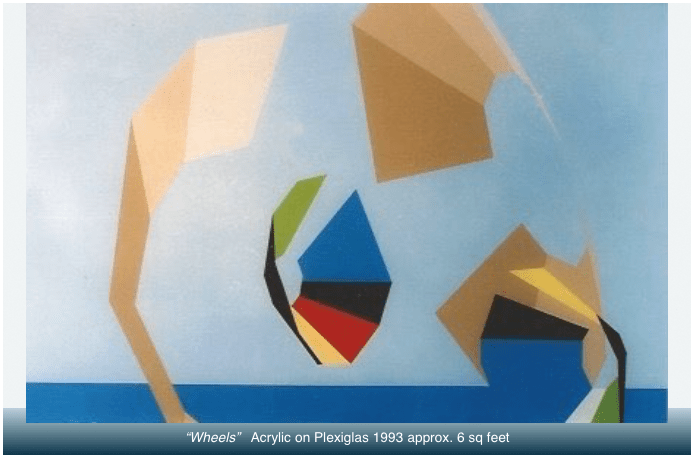
Wheels

Post 2g

During the weeks I worked on this hard-edged acrylic on plexi in 1993 the Stratford Concert Choir I sang with was very busy practising—for its annual December Concert—an exultant choral piece named “Wheels”.

A local composer, Geoffrey Thompson, had taken text from the prophet Ezekiel and set it to thunderous, rapturous music for organ and choir;  very Sci-Fi and dramatic;  epic space odyssey music of apocalypse.  Ezekiel had apparently witnessed the arrival of spaceships upon his desert landscape, and in a sense, and in his own time frame, had been “blown away” by the noise and spectacle, and the unworldly technological terror that so surpassed his own bronze age.

I couldn’t escape the overt influence of the wheels imagery, but for my purposes, I wanted only an ocean horizon and an infinitely deep sky that would be simultaneously real and abstract.  Unlike Ezekiel I was not courting any narrative of imminent danger or terror.  I was not intent on predicting apocalypse.  I wanted only visual contradictions in which the scale and placement of shapes are unknowable.  The beige / tan lenses, or digital camera shutters—just beginning to terminate the use of film—are thus purposefully closer than close and further than far while being at the same time reversible illusions (in the way an etching or drawing by Escher contains stairwells that visually flip inside / outside, upside / downside).

My reward for pursuing my own vision was that immense depth and purity of colour, space, and timeless quietude emerged despite the small physical scale of the painting.  In a year or two Mr. Thompson had died and my painting had already gone to sing its French Horn notes from the wall of the friend with whom I sang the First Bass melody lines of Wheels.
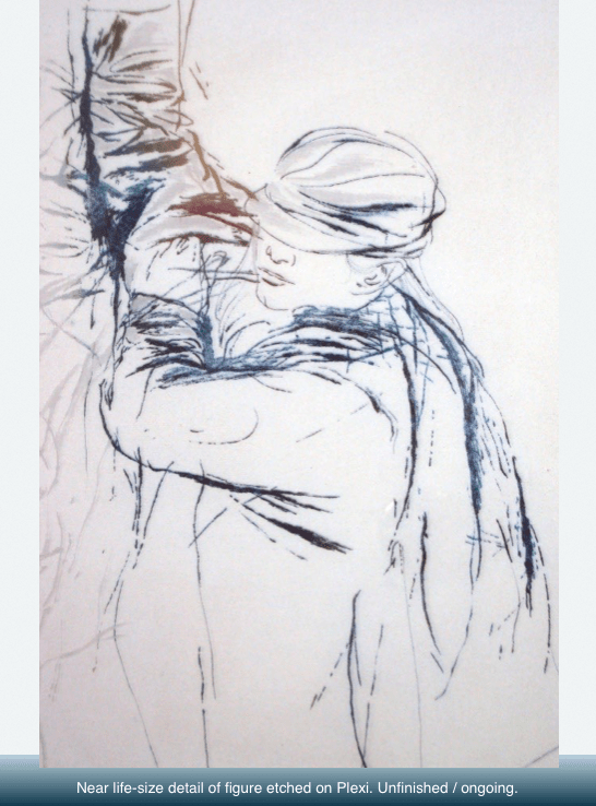
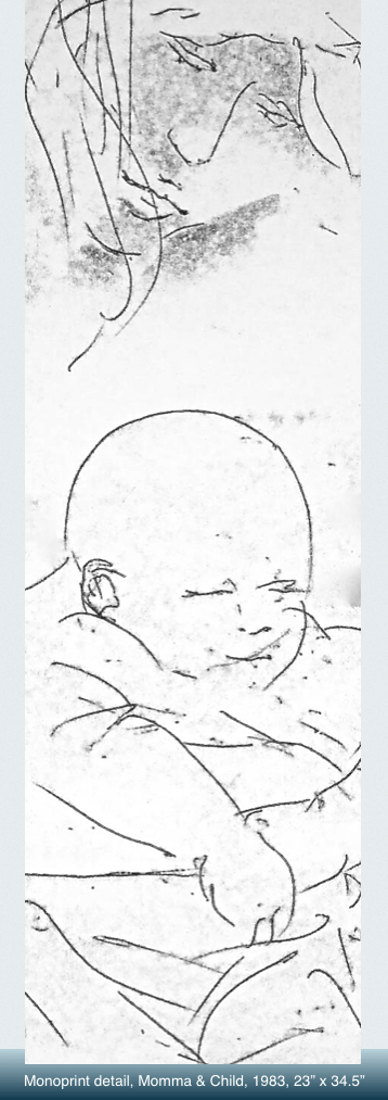
Momma & Child

Post 2e

A series of monoprints done in 1983 gave me the very challenging prospect of learning to draw blind and remain decisive, and in proportion, while drawing in reverse.  It taught me (1) surrender to the process, and (2) collaborate with the medium, and thus set me up wonderfully well for the acrylics on plexiglas I co-created with my materials in the late 80s.  

In the monoprint process a printing paper is placed face down in ink rolled onto a glass surface;  the artist draws upon the reverse side;  pencil pressure transfers ink onto the paper with the artist having no assurance of final result until the paper is pulled away and turned over.  

Extraordinary good luck stayed with me as the entire series of about three dozen prints were, on the overall, as bold and incisive as this one detail. 

One gallery, bullied by feminists and its own board of directors, reversed its contract to exhibit the series and informed me I would never exhibit with them again unless I found other subject matter;  one gallery accepted them but kept them in its print drawer until deciding to return them all to me;  The University of Waterloo did exhibit ten of them in 2005.  One viewer wrote in the comments column of the exhibit diary: “You gotta be kidding”.

Take Two

Post 2d

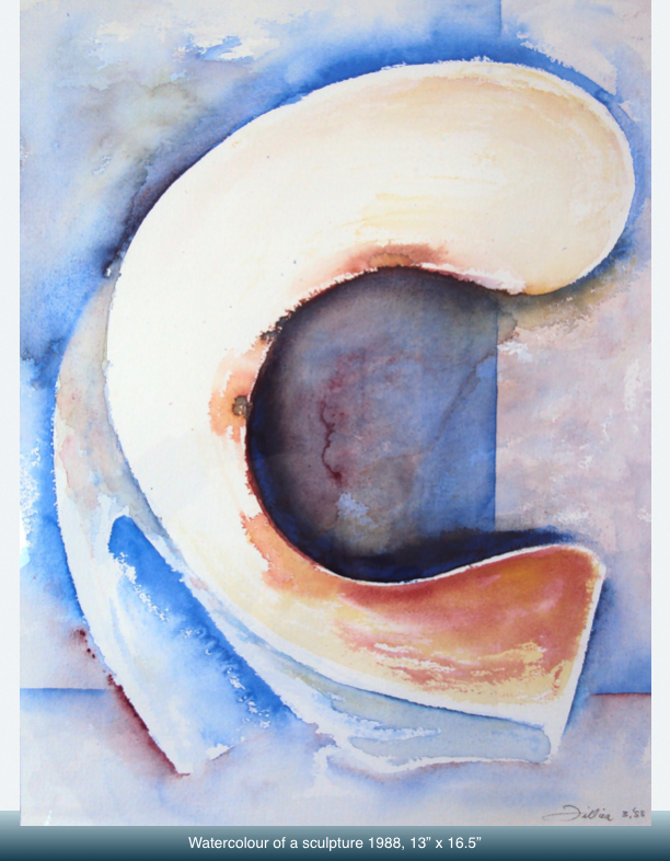
This sculptural object, being of rather thin plaster, survived a mere three years.  One day it tumbled from table to floor and I chose to not repair or remake it because it always reminded me of a penitent or perhaps even a grieving Madonna: Yes I had wanted gestural abstraction but not one to evoke religiosity. 

Fortunately a small watercolour made before the accident restored the original intent—a dancer or gymnastics athlete in an extravagant cirque-de-soleil choreography.  And whereas the original was white with few contrasting shadows, here, in a fresh start, was an opportunity that could be invested with dazzling blues and reds.

Three aesthetics emerged: a rather accurate rendering of the original form / shape with the dark, anti-matter negative shape becoming a powerful new force, plus,  the watercolour itself put on that array of dazzling riffs that the medium so exuberantly performs when allowed its own voice and minimal interference.

Some Faces Drawn 2

Post 1f

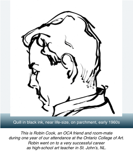
The example above is evidence that using just a quill in portraiture, even if it is for the first and only time ever, can yield astonishing results, for as spare as they are, the inscribed pitch-perfect lines still manage to evoke every nuance of Robin’s look at about 23.

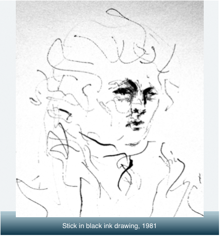
One of the most charming drawings I ever parented is the one immediately below, drawn with the end of a small stick dipped in ink.  This sketch can also be singled out as one that is jam-packed with rhythm, harmonics, and melodic phrases.  And the poetics of the unconventional approach.

Perhaps it’s even a “classic” Scott, begun as a find-a-drawing exercise: you start with a blank sheet and assemble marks one by one, allowing each succeeding mark to feed off its predecessor until they accumulate into one unified image.  This full drawing addresses the sitting figure to the knees and maintains the same touch throughout.  We each know a personality in the perpetual ruffle of brooding or walking on eggs.

Post 1g

Some Faces Drawn

Studies and sketches of faces with commentary. For a more comprehensive view of the overall variety of approaches but without commentary try the following YouTube video link:

Drawings of Faces by Filliere Parts A & B


Post 1k

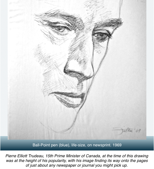
No precious pre-planning of shape, size, proportion here; no preliminary gridding for eye, nose, and mouth placement.  Quite simply, I saw another image of Trudeau in a newspaper, grabbed available paper and pen, and scorched the page with the image as I perceived it, somehow managing to incorporate other impressions gathered elsewhere of the character of Mr. Trudeau.  Done at warp speed I feel it misses nothing essential about the way we remember the personality of the man.


Post JD

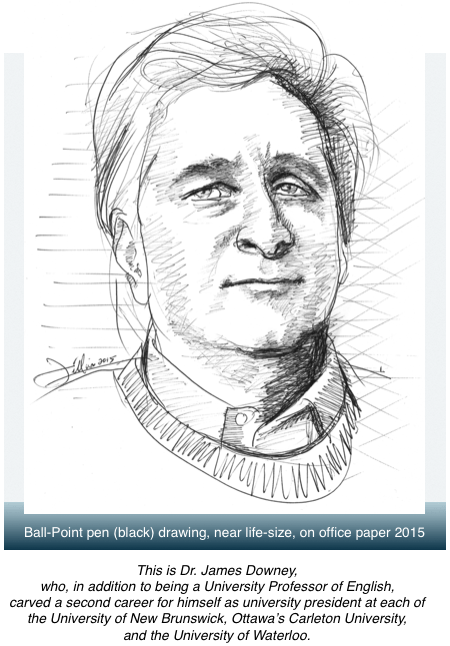
James and I have known each other since we were 16-year old freshmen at Memorial University in NL in 1956.  In the past decade he and I have worked together on three privately authored (his authorship), designed, stitched & assembled, limited edition book projects (my role—those latter aspects).  One of the three, Lord Beaverbrook and the Kennedys, was chosen by University of New Brunswick for a formal public edition published in 2012. It honoured most of my original design concepts for cover and inside but chose a black and white format rather than colour.  I keep it like a trophy on my favourite books shelf.

This year was the first time I’d attempted to draw him, and I’m so pleased and relieved to say that the portrayal came to the paper with the same readiness, sureness, and speed as with the Trudeau image, though 45 years separate them in production.

Peter Gzowski used to enjoy that remarkable social ease and generosity in Jim’s nature, and invited James to his CBC Morningside radio interview program on several occasions.

Belle Isle Fantasia

Post 1d

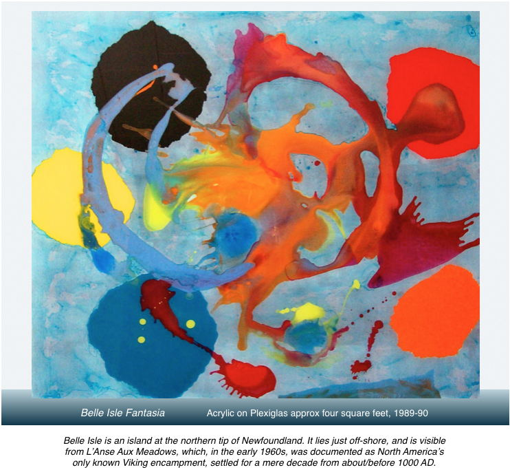
When the pools of colour had finally dried I turned over this piece of plexi to see if I had captured anything worthwhile in the randomly, almost blindly applied colour swaths.

The central swirl of raw, savage, ruthless colour, and shapes, and visual texture were immediately captivating and seemed laden with a very intense meaning … and, in a curious manner, demanded an archeological process of excavation, of examination of layers of thought and association, through which I would discover what this attempted piece of art really meant.  It’s akin to becoming a writer in order to figure out what you think.

The most immediate suggestion was of something apocalyptic.  Also, there was something true in feeling to my own local, very northern landscape and sky, which could at times be as fierce and as unsympathetic as the imagination says Tierra Del Fuego is in its even more distant southern exposures. This explosive sensational fantasia soon morphed into a glimmer, a patina, a shimmer of local history, of how shattering the culture inflicted on the area’s indigenous folk a millenia ago when Vikings descend upon them in northern Newfoundland: alien wayfarers; alien technology; alien behaviours; new, and very unfriendly notions of rivalry and of ownership of local resources; searchers for loot and booty to trade in Europe—in short, nothing short of a localized apocalypse.

But the image, at that point, didn’t yet have its Jupiter-like ring and wheeler/dealer orbiter moons: in this case the elliptical outer orbit of yellow-blue-orange-red-black.  Nor yet, in its lower right edge, the suggestion of any island.  The message was clear from the painting itself: it already knew most of what it wanted to trade in for its endgame definition.  My task would be to discover and resolve how to fulfill the needs of the core image, as it was not yet visually complete.

With coloured, torn-edged paper circles I explored for the exact placement of where these controllers ought to be, how to size, re-compose and stabilize the orbiters, and of which colour to specifically place where.  A slow and careful exploration eventually revealed a near pitch-perfect solution.  The outlines of the ragged forms were pencilled, and then slowly, carefully, very carefully, excavated from the back surface until clear of colour except where the original image needed to remain intact.  Then the five new shapes could be and were painted in.  The painting, however, remained incomplete until I recognized that a well-placed island would increase contrasting depths, imply greater reality, and lock everything into place.

Then it was that this painting confirmed my own definition of triumphant abstract: specific reality-bound content, specific intensity of feeling, spatial depth, dazzling colour: all achieved in the contemporary context of materials; and all in free, yet also highly controlled,  collaboration with accident: one might say—a contemporary understanding of how to meet life on the problem solving terms it offers, in fact demands of us.

Poured Paints

Cabot-Lodge2

Pouring paints upon a surface, by the late 1980s when this image was created, was no longer accepted as a creative act.  It was considered copy-catting.  Old Hat.  Outmoded by nearly a half century. And yet . . . this image is absolutely different and original from any ever poured on canvas.

Moreover, the image presented here delightfully defies four other dogmas settled upon the act of painting by painters and their art critics of the 1950s and 60s.  Strident proclamations and manifestos, verbal and written, were made that a painted image should eliminate all spatial references in order to be fanatically in tune with its 2-D surface; a second equally rubbish commandment was that forms should not evoke reality; thirdly, that the content of art could concern itself only with its own abstract formal elements—colour, texture, shape, composition—and lastly, that all narrative aspects of image must be avoided at all costs.

Artists quickly painted themselves into monastic (or ivy league) corners with their stripes, chevrons, targets, and numinous mists.  A few suicided out of the muddle, or complicated it even more with heavy alcohol consumption allied to a penchant for reckless driving.  A few, like yours truly, shrugged off the demands of this newly ascended / assembled / self-appointed painting academy-in-the-sky: We would set our own rules.

Having gone off the artistic grid myself by choosing, in 1972, to live a creative life in a very small town in northern Newfoundland, I felt no obligation to blindly follow all the modern canons set out in my university’s Art History Major brain washings, 1967-1972.

Attempting to pour liquid colours upon resistant, slick plexi instead of onto absorbant canvas injects a totally different interaction between the colours, and how they will settle out as they dry.  Add in the complication of working in reverse and there is a huge learning curve of acceptance of accident; of guiding rather than controlling the process; of becoming extraordinarily alert to the possibilities of the ground and the paints; even of which colours are not chemically compatible (and, if that were the case, how might that be creatively exploited to best advantage).  It would sometimes take two or three days before the pools of paint dried enough to turn over the plexi to find the exact nature of what had presented itself on my own miniature self-defined altar.

In this instance I had no doubt that a completely original, lovely, lyrical piece of art had come into existence out of my humility before, and my collaboration with, the most contemporary of materials.